The Art Of Curating (Part 1) – Space. Organise. Impact.
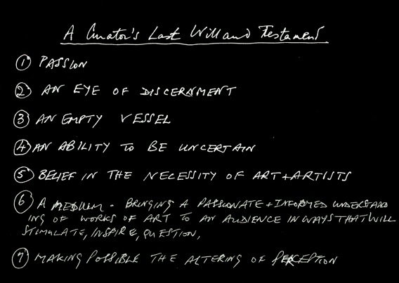
Cover Image: Nick Waterlow. A curator’s Last Will and Testament, 2009
When it comes to curatorial practice in the 21st century it appears the term is now used to broach a variety of contexts. The term ‘curating’ itself has become embedded within contemporary culture, retail outlets boastfully speak of ‘curated’ clothing lines whilst DJ’s curate festivals and set lists. The thought, however, remains grounded in delivering an experience by strategically organising a body of images, actions or information, mediated for an audience. When it comes to curating artworks many components are usually considered and amalgamated to create a comprehensive display for the viewer. Questions to consider before curating an exhibit are: What is the function of the exhibition? How can space best be utilised? What will be communicated to the viewer? Even clothes shops in promising a ‘curated’ collection aim to engage a psychology of meticulous planning and thought, intended to make a consumer buy their product, and it is this clever planning which makes for successful exhibitions.

There are many approaches taken to art display, from the condensed wall hanging of The Salon, to the minimal modernist white cube approach, curatorial styles set out to facilitate artistic intention and influence viewer interpretations. There are no right or wrong methods of curatorial practice as long as the objects in a collection aren’t left broken in a dark damp room with condensed visitor pathways, there are often no serious issues, but even then this could be intentional if objected by the artist.
When curating an exhibition it can be easy to let creative ideas override artistic intention, as a curator we must remember we are facilitating an environment to allow maximum potential for the artwork. Curatorial planning can be an extension of the artwork, though this is usually typical of conceptual artworks and with the discretion of the artist. If the artwork is a light installation, then the curatorial style combines with the art to lend itself to the medium. However, if you are curating an exhibit on 18th-century British painting it might seem unruly to have the lights flashing on and off, thus distracting from the purpose of the exhibition. Art takes an autonomous existence when inhabiting a blank space so to aid curatorial thought this article sets out to format a generic set up with tips on formatting an exhibition to a professional standard.
Space
Critical attention is necessary for addressing the response of how the display will be perceived. If you are an artist displaying your own artworks it can perhaps seem easy to allow sentiment to oversight what should be facilitated to the general spectator. Here is a general formatting which allows ease of viewing art when curating a display without being assaulted with imagery and literature.
Know your space.
Within the field of curating there are impulses to reinvent a space with artworks however less can be more in wanting the artwork to speak for itself. By measuring all the dimensions of your space you are ensuring maximum utilisation of the width and height of the walls and floors, as well as space the viewer is positioned within. What compositions well together on any given space allows easy accessibility for viewers and by visualising how the art will work in the space can allow you to make adjustments prior to the exhibition opening, avoiding any last minute panic. Easy software to get to grips with designing your layout can be as simple as Ikea kitchen planner or sketch-up, which gives concise measurements, space adjustments and inserts without needing a masters in computer coding.
It might be boring, however, having a public space requires factoring in awareness to health and safety. Is there enough space to leave in event of a fire? Is everything secured so not to break off a wall and kill someone? Also plan the space to protect the art, the less room to move means more chance of knocking objects. In 2015 a 12-year-old Taiwanese boy at a gallery in Taipei put his fist through a £1 million 17thcentury painting by Paolo Porpora, when he tripped over a rail holding his drink. Prevention is better than cure so risk asses your space. Once you’re comfortable with space have fun with arrangements but always be conscious of allowing your viewer and the artwork space to breath.

Organise
Impact

Selecting unnecessary artworks for a display can weaken an exhibit for the sake of filling space and can render an exhibition incohesive. Adding a ceramic chicken to that series of abstract brushstrokes to reference earlier artistic merit and style may not be the most suitable utilisation of the space. Tenuously linking the brushstroke paintings to the chicken will also cause oversight to the objective of the exhibition, however, this does not necessarily mean different mediums and styles don’t work well together if done in intellectual and interesting ways.
Written By Lewis Kittle.
